How I see the world
I am colorblind. The world looks different to me than to you — greens and reds blur together, and what you see as distinct, I see as shades of one color. That shapes everything I make.
Side by side
The same scene, two ways of seeing it.
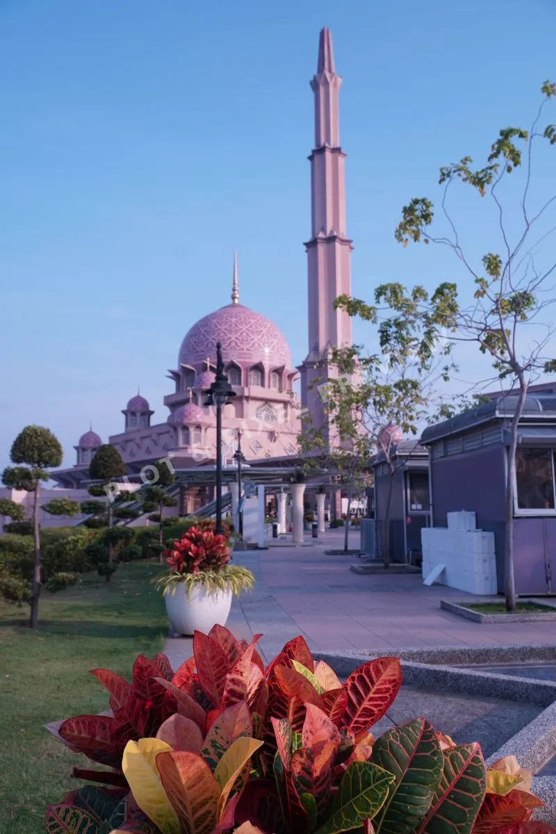
What most people see. Clear reds, greens, and warm tones.
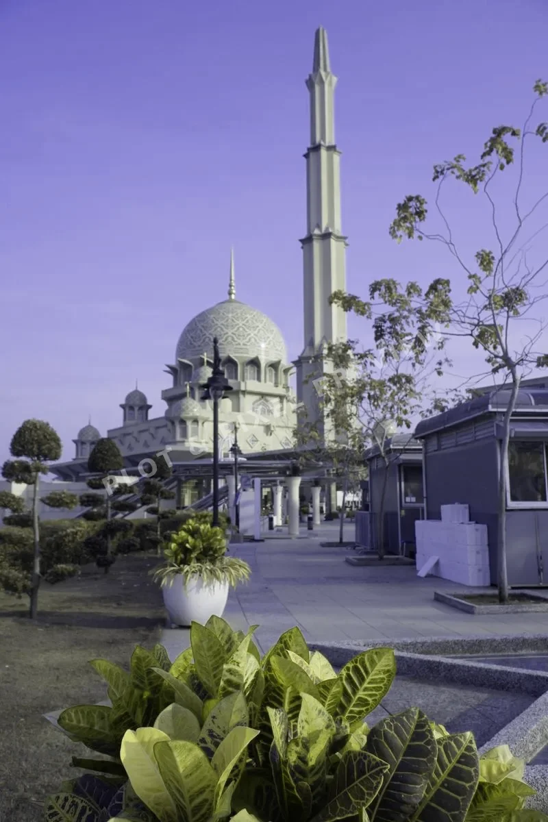
Greens and reds blend. I rely on value, shape, and light.
What it means for me
I can't tell a ripe tomato from a green one by color alone. I check the feel, the stem, the weight. I can't rely on red and green traffic lights. I learned early to read the world through value — the light and dark — rather than hue.
That habit became my photography. When I shoot, I'm not looking for vivid greens or saturated reds. I'm looking for shapes, textures, light and shadow. The muted greens and warm ambers in my work aren't a style choice — they're how the world actually looks to me.
And I don't touch anything up. Other photographers spend the afternoon in post, pushing the colors until the photo looks better than the day felt. I don't — the file is what was there. WYSIWYG. If the light was flat, the light was flat. That isn't a limitation. That's the point.
Clients sometimes say my photos feel "calm" or "understated." I think that's because I'm not trying to shout in color. I'm telling the story with form, and the color comes along for the ride.
Why the muted greens and ambers
My site uses a leaf-green and harvest-amber palette. Not because it's trendy — because it's the color world I actually live in. When I pick a color, I'm picking the one I can see clearly, the one that reads well in my vision.
Leaf Green
#3A6B35
Harvest Amber
#E0A458
Warm Paper
#F4F1E8
Photography, the way I see it
If you want a photo that doesn't shout — one that's calm, honest, untouched, and tells the story through shape and light — that's what I make.
Browse the work →